Client
U.S. Soccer Federation &
Arthur M. Blank Family of Businesses
Agency
AKQA
Role
Creative & Design Direction
Year
2024
Challenge
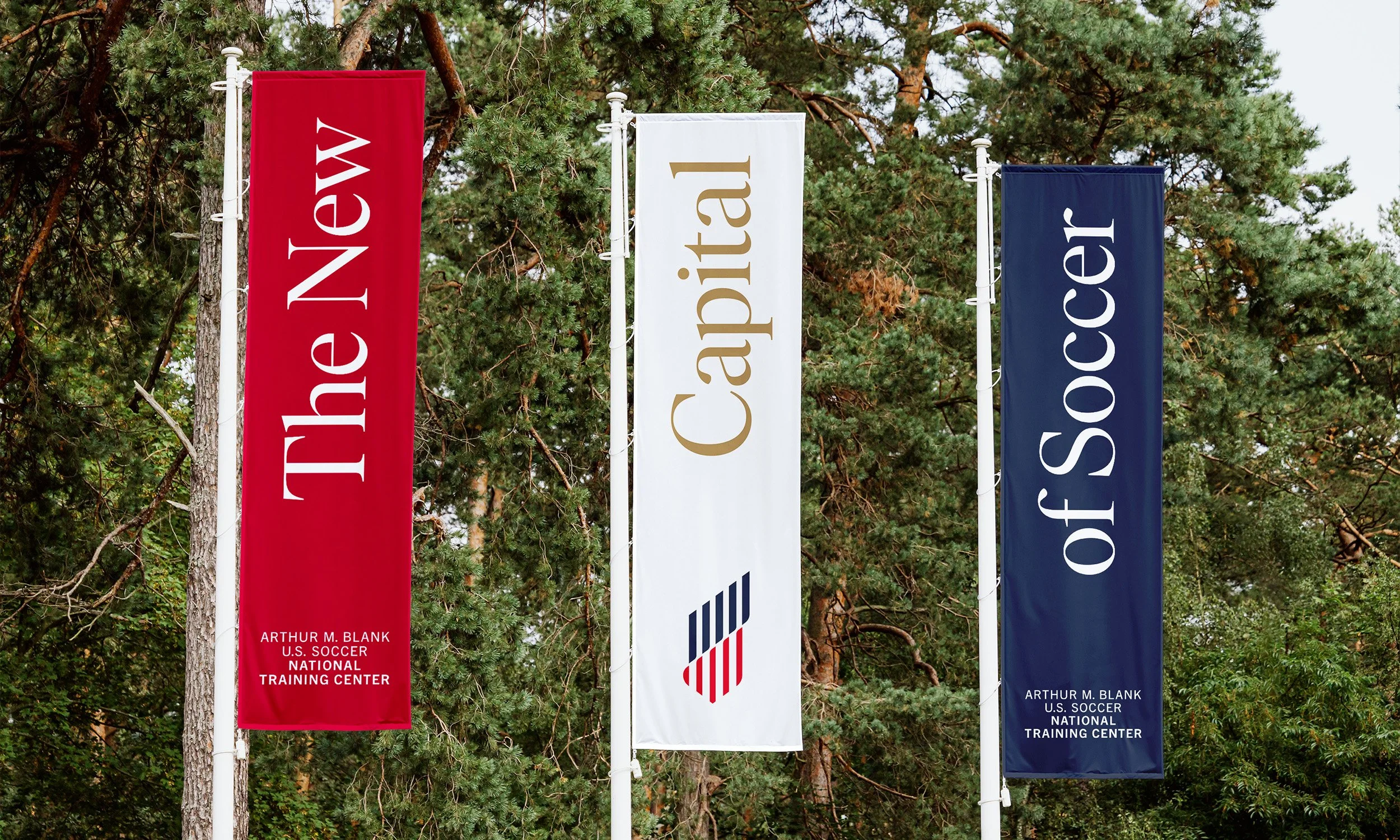
Create a new brand identity for the new home of the U.S. Soccer Federation
The brief
Unlike traditional football powerhouses, U.S. Soccer lacked a dedicated national training center, relying on varied facilities over the years. In 2023, the announcement of its Chicago-to-Atlanta headquarters move and plans for a state-of-the-art training center marked a turning point. U.S. Soccer partnered with AKQA to craft a brand embodying its relentless pursuit of excellence and inspiring future generations. Together, we developed a comprehensive brand identity and strategy, positioning U.S. Soccer for a bold future.
▲ Solution
Inspired by the U.S. Soccer crest and national flag, the mark symbolizes the Training Center as the heart of American soccer—a beacon of pride, patriotism, and ambition. Its upward motion reflects the American spirit of optimism and relentless pursuit of excellence, while the stripes honor our history and the teamwork central to soccer. The five lines represent the core values of our brand personality: steadfast, courageous, inspired, relentless, and historic.
Team
Press
Design Direction
Creative Direction
Design & Art Direction
Strategy
Strategy, Copy
Project Manager
Manuel Ortiz
Thad Goad
Martin Pohlmann
Alyson Gaiser
Tom Mullen
Tara Bates


